How/to
I create the identity project for How/to, a brand consultancy in São Paulo.
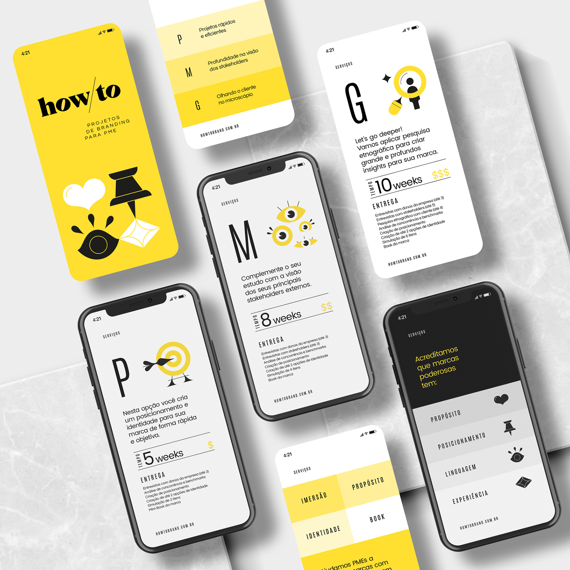
From the same group as Why Branding, How/to is a company aimed at small and medium-sized businesses, offering structured solutions for different timing demands and investment in strategy, positioning and branding.
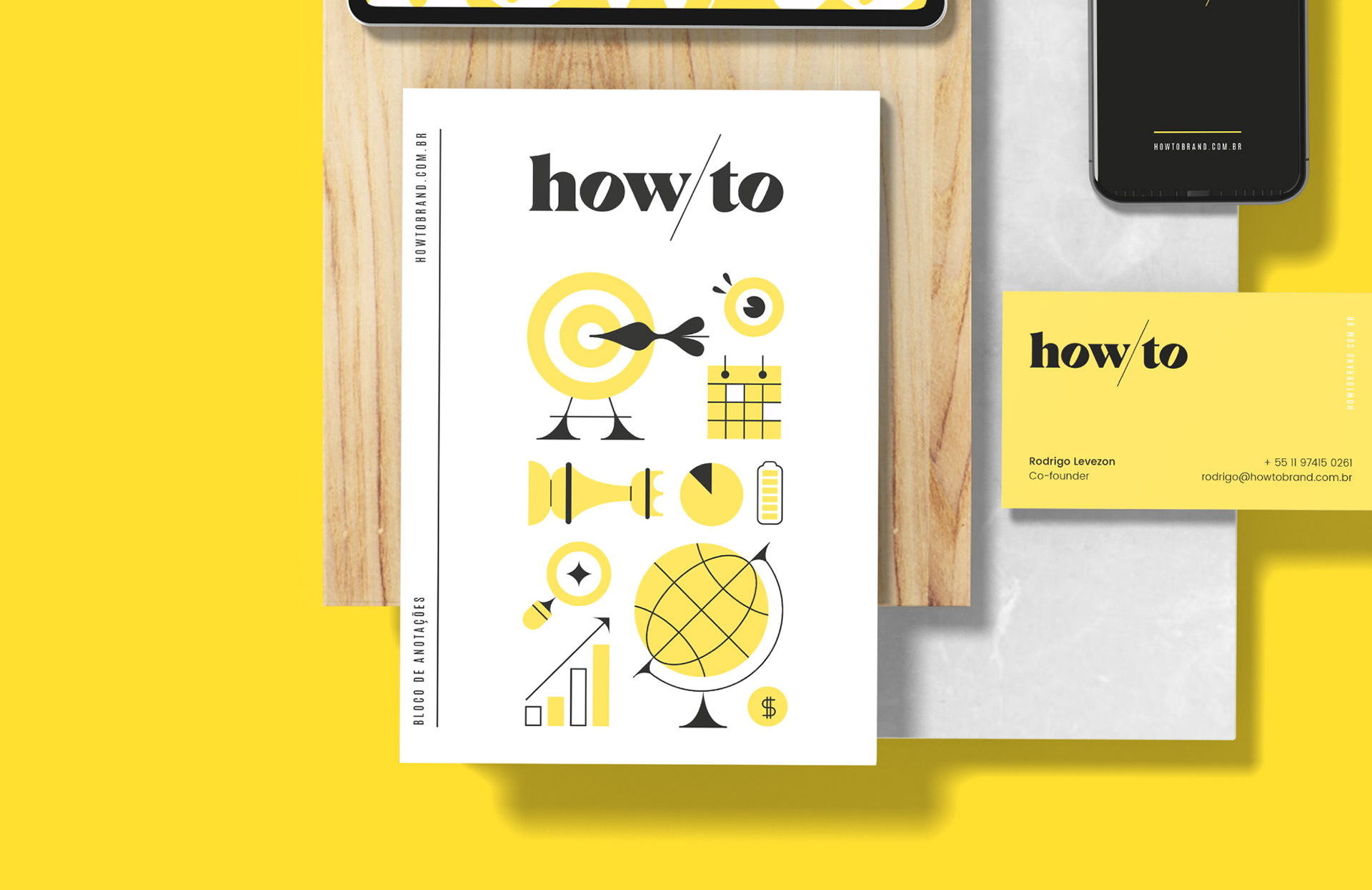
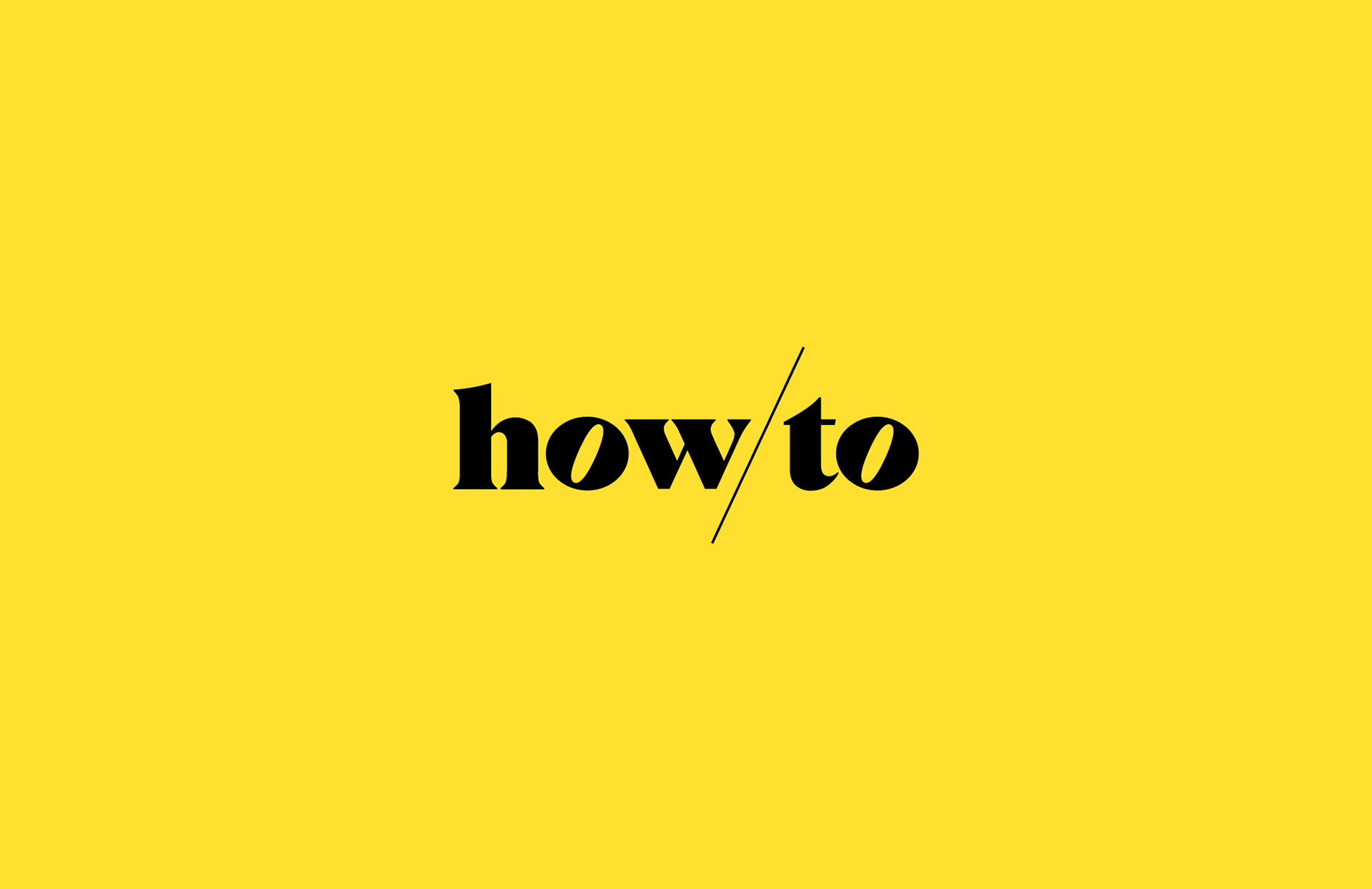
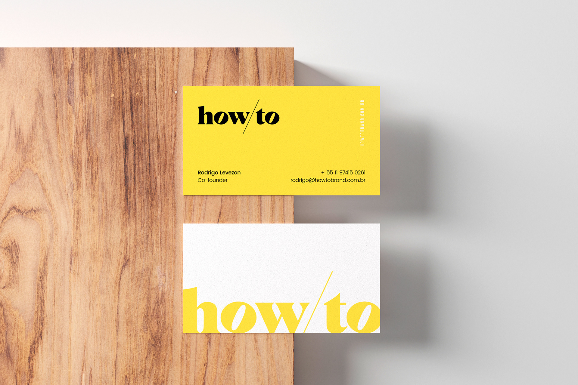
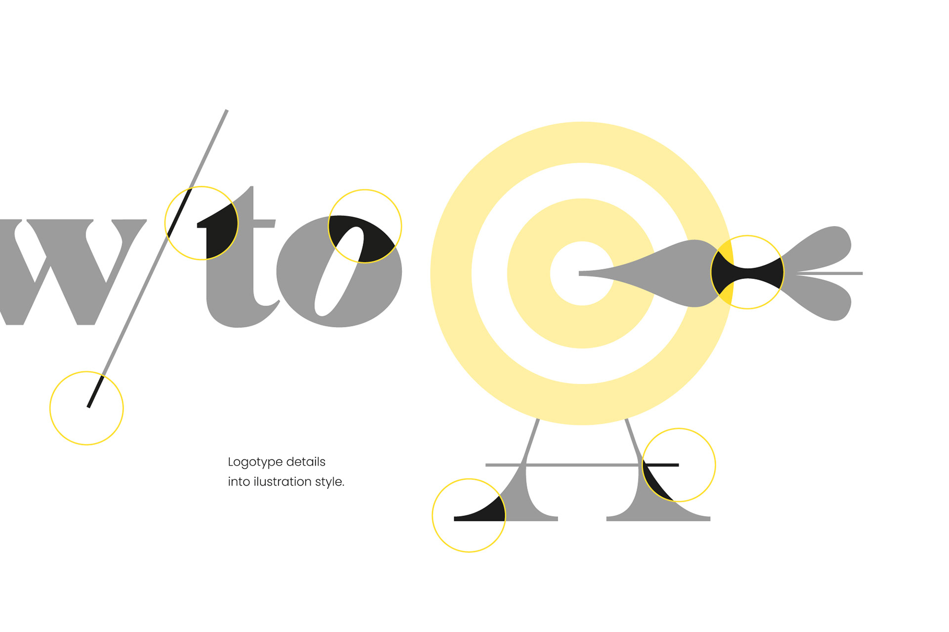
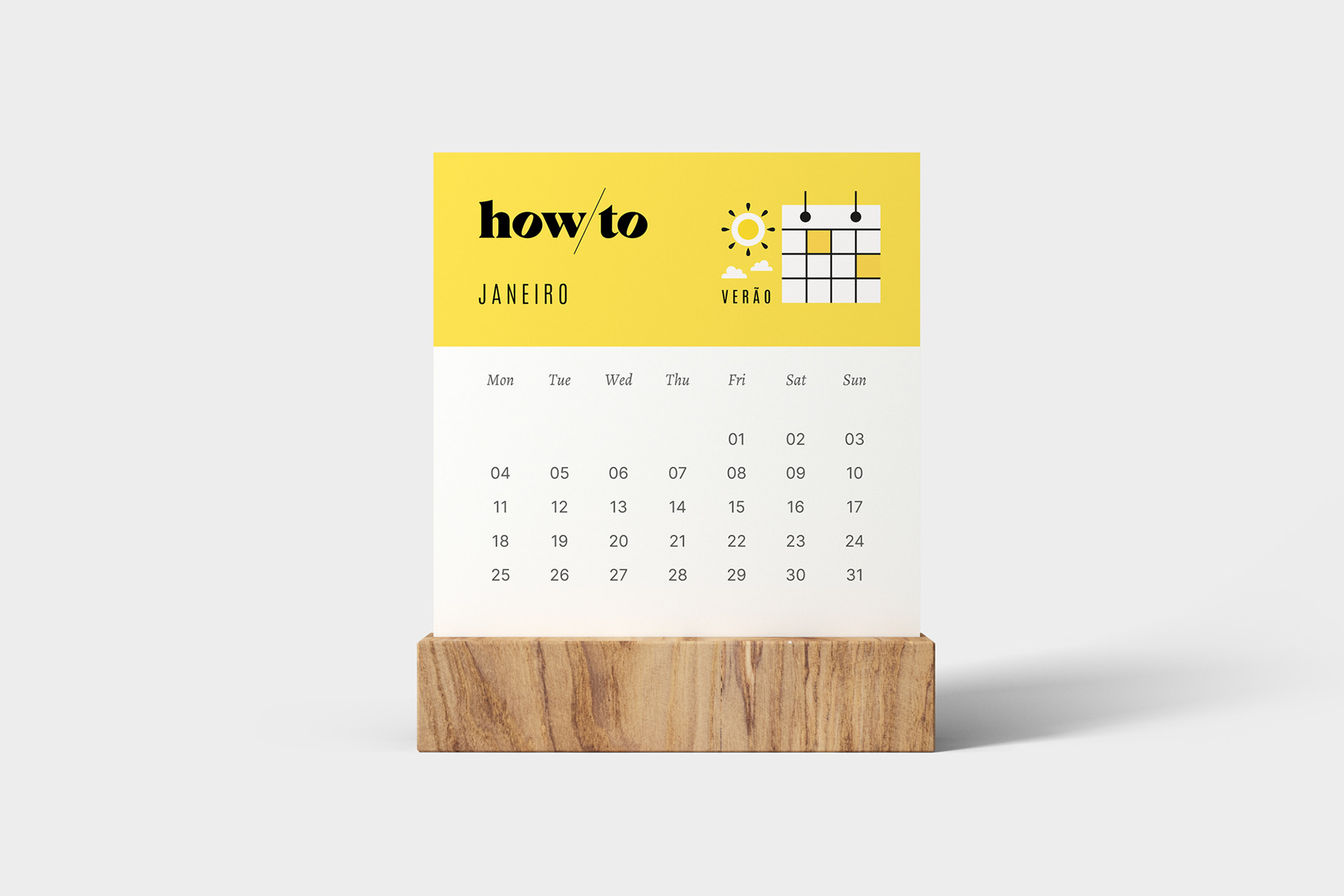
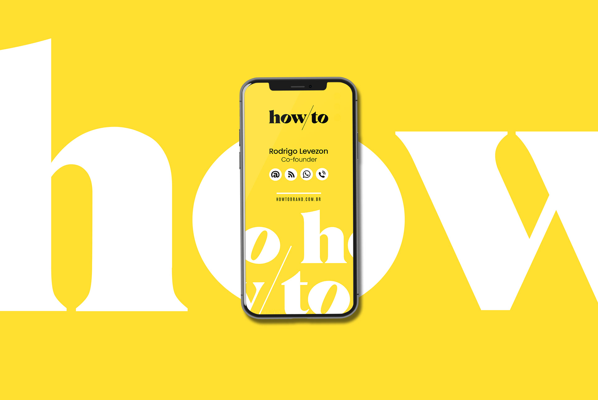
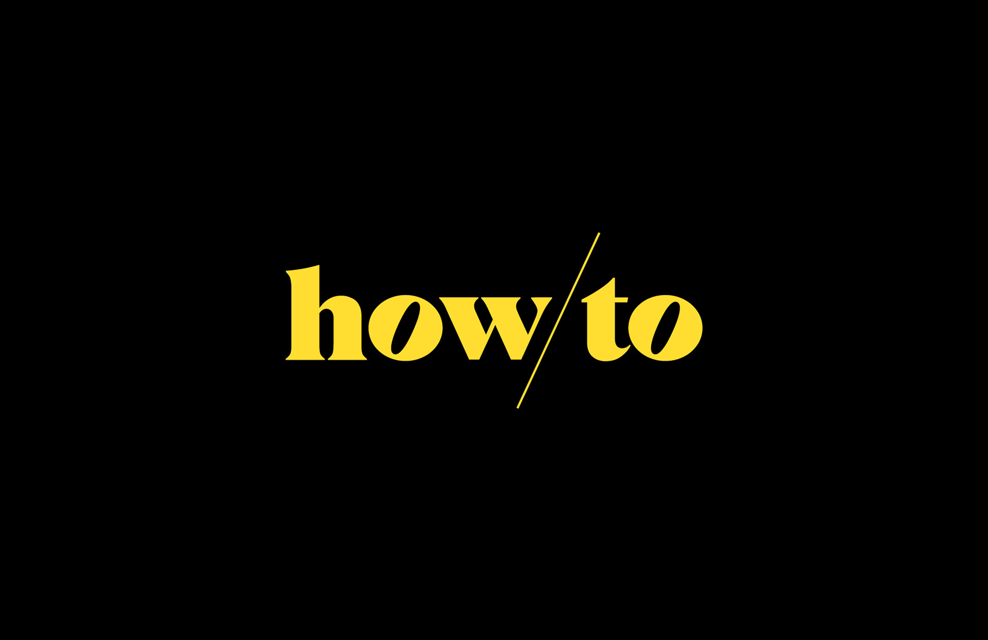
For the How/to logo, I chose a bold, serif typeface that strengthens the brand. For greater contrast, I left the bar that divides the name in a thin and elegant line, in an ascending diagonal that converses with the inclinations of the letter "W" and the hollow space of the letter "O".
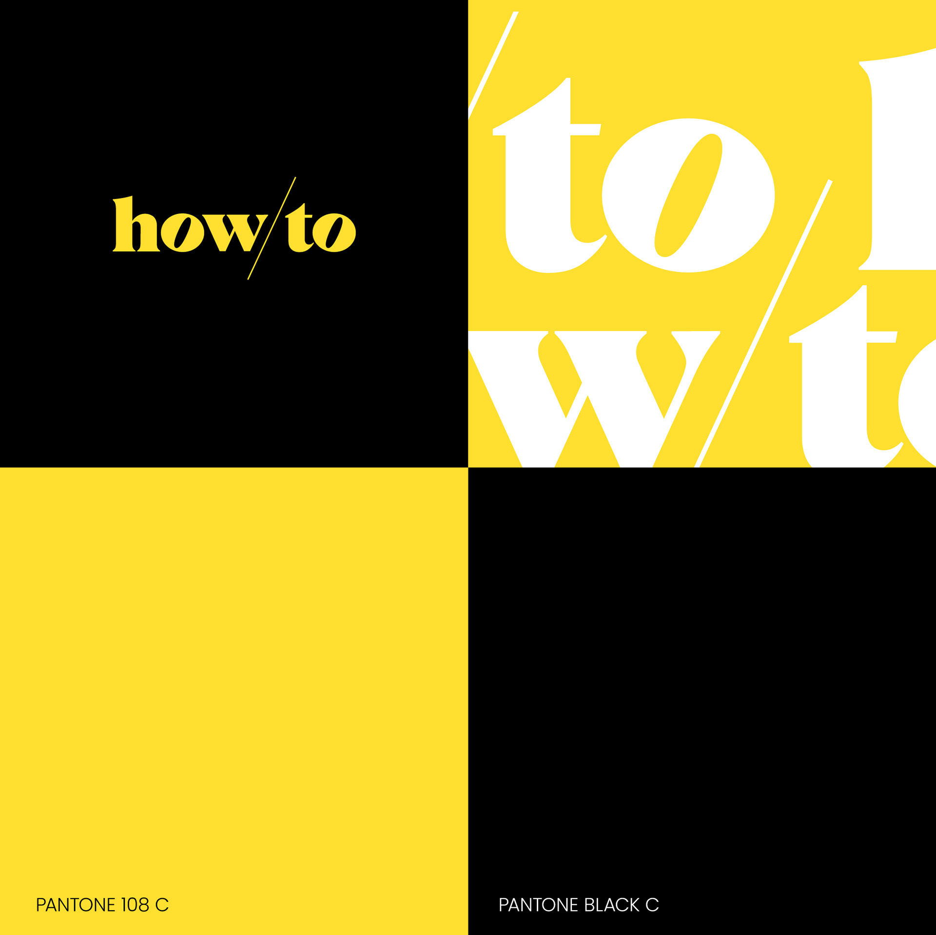
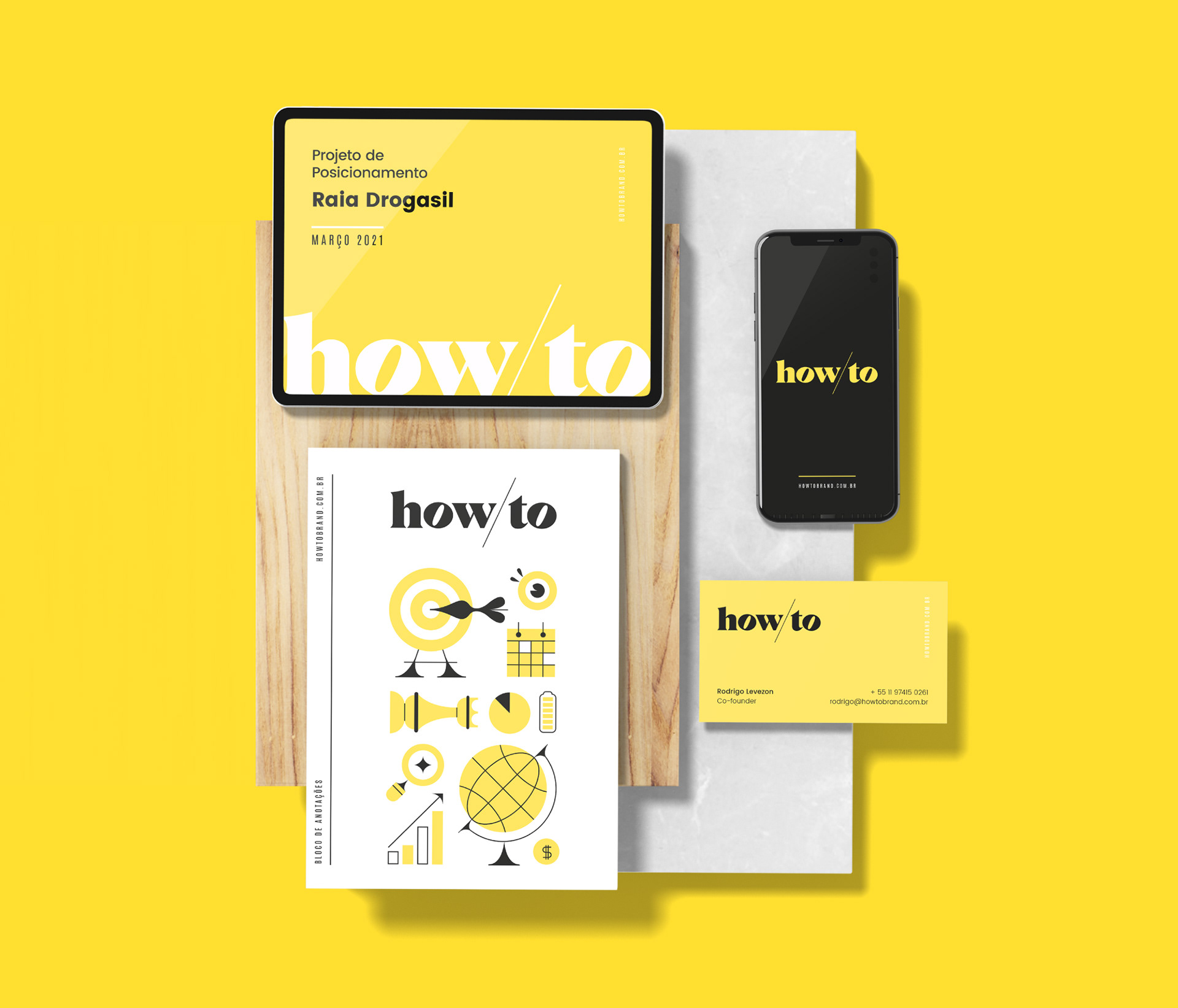
Yellow and black make the brand more energetic and strong. I used nuances of these colors for the brand's language and collateral materials.
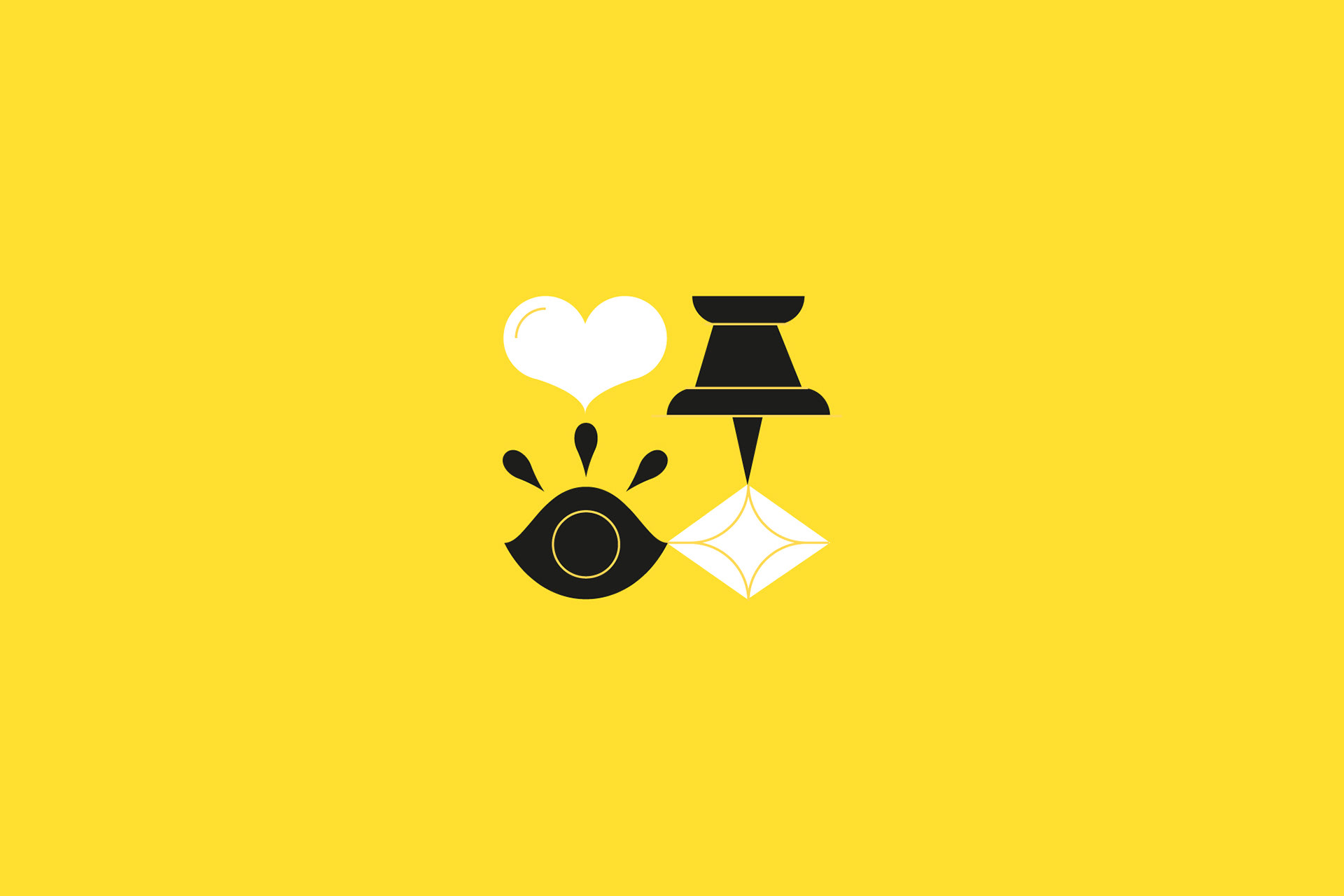
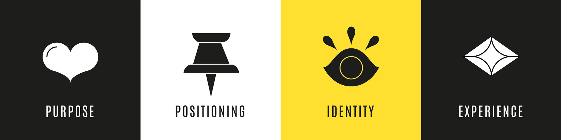
To complement the brand, I developed some illustrations in pictogram format that were inspired by the characteristics of the logo: 1) the diagonal line, 2) the serif (small lines and extensions that occur at the end of the stems of the letters) and 3) the contrast of thickness of the stems of the letters. I also created four specific icons to represent each of the company's fronts: a heart for purpose, a pin for positioning, an eye for visual language and a diamond for experience.
The final look of the brand mixes strength and elegance, as well as simplicity and dynamism.

Gabriel Fagundes, Brand Designer and Illustrator.
Thank you. If you like it, please, appreciate :)